Chapter 12 Using linear models for prediction
Once we have fitted a linear model, we can predict what the dependent variable would be for particular values of the independent variables, and provide an interval around our prediction.
Returning to the election example, we would like to predict the difference in absentee votes, given the difference in machine votes of -564. We define a vector \(\mathbf{x}\) that includes the independent variables of interest, and a 1 for the intercept, such that \(\mathbf{x}^T \hat{\boldsymbol{\beta}}\) gives the desired point on the fitted regression line. So we would have \(\mathbf{x}^T = (1,\, -564)\) and \[ \mathbf{x}^T \hat{\boldsymbol{\beta}} = \hat{\beta}_0 - 564\hat{\beta_1}. \] This is our point estimate of the dependent variable. We won’t give the derivation here, but a \(100(1-\alpha)\)% prediction interval is given by \[ \mathbf{x}^T \hat{\boldsymbol{\beta}} \pm t_{n-p,1-\alpha/2}\sqrt{\hat{\sigma}^2(1+ \mathbf{x}^T (X^TX)^{-1} \mathbf{x})}. \]
12.1 Obtaining predictions in R
We first fit our model:
election <- read_csv("election.csv")
lmElection <- lm(absentee.diff ~ machine.diff +
                   I(machine.diff^2), election)
If we want to predict at new values of the independent variable, we need to set up a new data frame with the desired independent variable(s) values, in which the column name matches that in our original data frame:
newElection <- data.frame(machine.diff = -564)We can then use the predict() command
predict(lmElection,
        newdata = newElection,
        interval = "prediction",
        level = 0.95)
## fit lwr upr
## 1 -235.8537 -871.2089 399.5016If we don’t specify newdata, the default is to compute prediction intervals for all independent variables in the original data frame, used to fit the linear model. We can make use of this to plot prediction intervals. (Given the context of suspected fraud, we’ll use slightly wider intervals: 99% intervals.)
First, we make the prediction intervals, and combine them with the original data in a new data frame:
electionPredictions <- cbind(election,
                             predict(lmElection,
                                     interval = "prediction",
                                     level = 0.99))
We then can now make a plot. We use geom_ribbon() to draw the intervals, with the argument ymin set to the interval lower limit (lwr) and ymax set to the interval upper limit (upr). The alpha argument controls the transparency of the interval in the plot.
ggplot(electionPredictions, aes(x = machine.diff,
                                y = absentee.diff)) +
  geom_point() +
  geom_smooth(method = "lm", formula = y ~ x + I(x^2),
              se = FALSE) +
  geom_ribbon(aes(ymin = lwr, ymax = upr),
              alpha = 0.1,
              fill = "red") +
  annotate("point", x = -564, y = 1025, col = "red",
           pch = 4, size = 4) +
  annotate("text", x = -564, y = 1150, col = "red",
           label = "disputed election")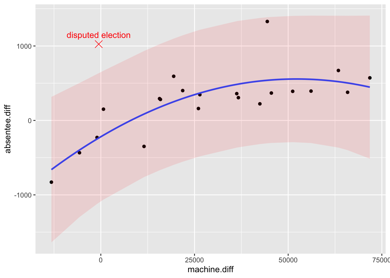
We can see that the disputed election result lies some way outside the prediction interval: it does appear to be an outlier. In fact the judge did rule that there had been fraud, though on the basis of other evidence, rather than this particular analysis.
Example 12.1 (Prediction with a linear model.)
Using the airquality data, first make a data frame with the missing values removed.
airQualityReduced <- na.omit(airquality)Then fit a simple linear regression model of log ozone concentration on temperature using the data frame airQualityReduced (taking out the missing values will make plotting prediction intervals easier). Make a plot showing point-wise 95% prediction intervals for the log ozone concentration given the temperature, and obtain a 99% prediction interval for the log ozone concentration, given a temperature of 80.5 degrees F.
Solution
We first fit the model.
lmAirQuality <- lm(log(Ozone) ~ Temp, airQualityReduced)Now we make a new data frame with the prediction intervals:
airQualityPredictions <- cbind(airQualityReduced,
                              predict(lmAirQuality,
                                      interval = "prediction",
                                      level = 0.95))
Then, to make the plot:
ggplot(airQualityPredictions, aes(x = Temp,
y = log(Ozone))) +
geom_point() +
geom_smooth(method = "lm", formula = y ~ x ,
se = FALSE) +
geom_ribbon(aes(ymin = lwr, ymax = upr),
alpha = 0.1,
fill = "red")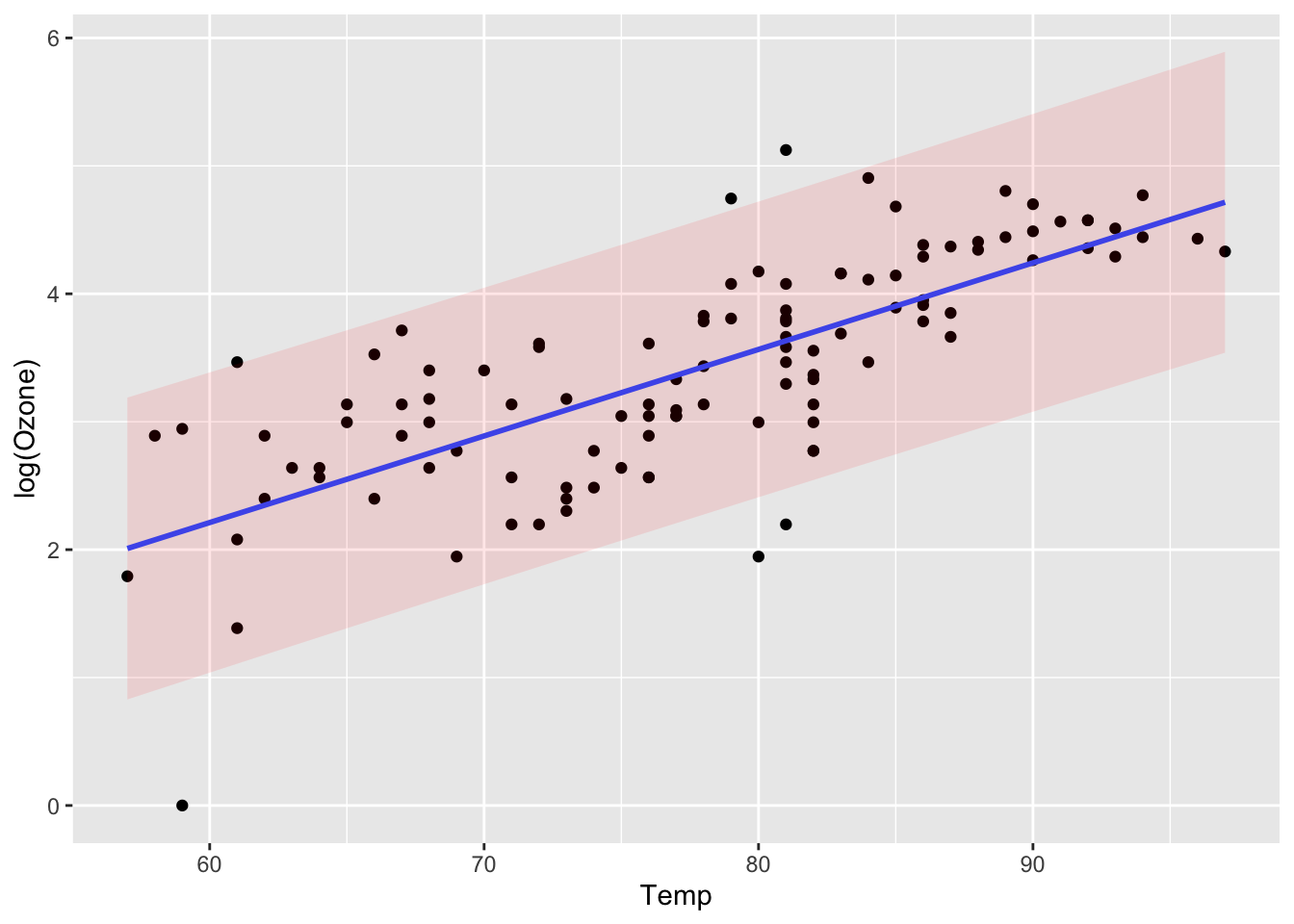 To get the prediction interval for a particular value of
 Temp, we need to set up a new data frame first:
newTemp <- data.frame(Temp = 80.5)We then use this in the predict() command:
predict(lmAirQuality, newdata = newTemp,
        interval = "prediction",
        level = 0.99)
## fit lwr upr
## 1 3.599131 2.070096 5.128166