Section 19 Presentation of plots
You should think carefully about how you present your plots to others. With minimal plotting commands, you can obtain a plot quickly and easily, but it is unlikely it will be suitable for including in a report.
For this chapter, you will need to install the MAS6005 package, which is available on GitHub only. Install it with the commands
19.1 The basics
Using the mtcars data frame, we’ll make a scatter plot of miles per gallon against weight. For more information about these variables, use ?mtcars. Suppose we use the following code, and the figure below is used in a written report
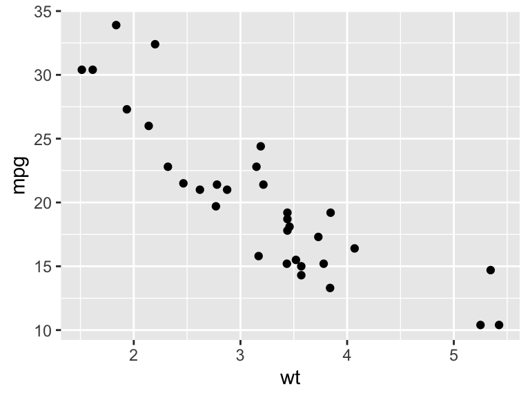
Figure 19.1: Fuel economy and weight.
This standard of presentation would be unacceptable in any report! To improve the figure, we should
include proper axes labels: never simply use the R variable names;
specify the units;
give sufficiently detailed captions so that the figure can be understood on its own, and include a conclusion: what do we learn from the figure?
The first two points are obvious, but the third perhaps less so, so we’ll discuss this a little more.
19.2 The caption test
You may be unsure as to whether you should include a particular plot or not. You may be tempted to ‘err on the safe side’, by including the plot, but if the plot doesn’t tell the reader anything useful, this will just lead to a bloated report. A simple test to apply is as follows.
State, in your caption, what conclusion the reader should draw from looking at the plot. If you can’t think of anything to say, this probably means that there’s nothing useful to be learned from your plot: leave it out of your report!
This doesn’t mean, for example, that a plot must show an interesting relationship between two variables; a plot may suggest that two variables are unrelated; that can still be informative to a reader. There will also be exceptions: it may be helpful to include a plot simply to show what data are available, but it should be obvious when you need to apply the caption test.
It’s also good practice to state the data source in the caption. So in summary, the caption should include
- a title for the plot;
- a conclusion that can be drawn from the plot;
- the source of the data, if appropriate.
Putting this all together, an improvement would be
ggplot(data = mtcars, aes(x = wt, y = mpg)) +
  geom_point() +
labs(x = "Weight (lb/1000)", y = "Miles / (US) gallon") 
Figure 19.2: Fuel economy ) and weight for 32 car models. Heavier cars tend to be less fuel efficient. Source: Motor Trend (1974)
19.3 Caption or title?
In a written report, plots will usually be labelled by a figure number, and then the plot information would all go in the caption. It is not recommended to have an additional title at the top: you would then have plot text in two different places.
However, if your plot is being presented in a web page, or in some talk slides, then you may not have a figure label and caption. Here, you can use additional ggplot2 commands to produce a title, conclusion and data reference within the plot itself. For example (with subtitle used for the plot conclusion, and caption used for the data source),
ggplot(data = mtcars, aes(x = wt, y = mpg)) +
  geom_point() +
  labs(x = "Weight (lb/1000)", y = "Miles / (US) gallon",
       title = "Fuel economy and weight for 32 car models",
       subtitle = "Heavier cars tend to be less fuel efficient",
caption = "Source: Motor Trend (1974)") 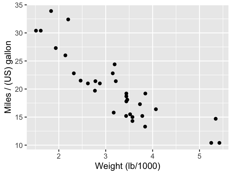
19.4 Customising the appearance of a plot
You can change just about any aspect of the appearance of a plot. If you have a legend in your plot, it’s likely you’ll need to modify it, as the default will use data frame column names. You may also wish to change the grey background used by default in ggplot2. Font sizes will need changing if they are too small in your final report.
The R Graphics Cookbook is an excellent reference here. (The format used throughout is to state a “problem”: something you want to do with your plot, and then provide the code solution and discussion). Some chapters in particular to look at are
19.5 Refining a plot: an example
We’ll now give an example of creating a plot, and then thinking about how we might improve it (assuming we’ve already got ‘the basics’ right, in that the axes titles and caption are satisfactory.)
19.5.1 The data to plot
We consider the mvscores data set from the MAS6005 package. The aim is to compare test match batting scores for one player, Michael Vaughan, between the matches he played as captain, and the matches where he was not captain. The hypothesis is players tend to perform less well, if they have the added burden of captaincy.
The data set also records whether each score was in the first or second innings; batting can be more difficult in a second innings, due to wear of the pitch.
To summaries for those with no interest in/knowledge of cricket:
- we want to illustrate how/if the values in
runsdiffer depending on thecaptainvariable (a 2-level factor:yesorno) innings(a 2-level factor:firstorsecond) is a ‘blocking variable’: we are more interested in comparing captain/not captain scores within the same innings type than between different innings types.
19.5.2 A first attempt: four histograms
We’ll first try producing four histograms of scores: one for each combination of captain and innings. Note that
- we use the
gridExtrapackage (Auguie 2017) to arrange the plots in a 2x2 grid; - plots produces by
ggplot2can be assigned to variables, and used later in other functions.
p1 <- mvscores %>%
  filter(innings == "first", captain == "yes") %>%
  ggplot(aes(x = runs))+
  labs(x = "First innings runs, captain") +
  geom_histogram()

p2 <- mvscores %>%
  filter(innings == "first", captain == "no") %>%
  ggplot(aes(x = runs))+
    labs(x = "First innings runs, not captain") +
  geom_histogram()

p3 <- mvscores %>%
  filter(innings == "second", captain == "yes") %>%
  ggplot(aes(x = runs))+
    labs(x = "Second innings runs, captain") +
  geom_histogram()

p4 <- mvscores %>%
  filter(innings == "second", captain == "no") %>%
  ggplot(aes(x = runs))+
    labs(x = "Second innings runs, not captain") +
  geom_histogram()

gridExtra::grid.arrange(p1, p2, p3, p4, nrow = 2)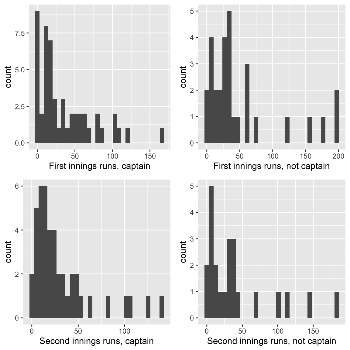
Figure 19.3: Test Match runs scored by the England Cricketer Michael Vaughan, in each innings, and whether or not he played as captain. His scores tended to be higher when he did not play as captain. Source: ESPNcricinfo.
The main thing I don’t like about this plot is that the \(x\)-axis scales are different for each histogram, which makes comparing the histograms harder. We could set the scale manually (see ?ggplot2::xlim) but facets might work well here.
The \(y\)-axis scales are also different. This issue is slightly more complicated, in that the numbers of observations used for each histogram are different, so it’s really the shapes of the histograms that we want to compare. One options is to scale each histogram to have total area 1 (so it’s like a density plot.)
It’s also worth thinking about the arrangement of the plots within the grid. I would use rows rather than columns to represent the main factor of interest (captain), so that the main comparisons involve looking at histograms aligned vertically, not horizontally: any ‘shift’ in distribution is easier to see.
An alternative plot, which I prefer, is as follows.
ggplot(mvscores, aes(x = runs, y = ..density..))+
  labs(x = "Runs scored") +
  geom_histogram() +
  facet_grid(rows = vars(captain),
             col = vars(innings),
             labeller = label_both)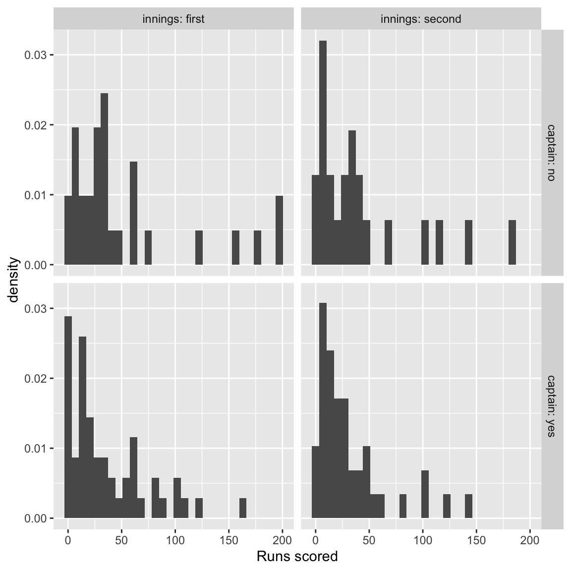
Figure 19.4: Test Match runs scored by the England Cricketer Michael Vaughan, in each innings, and whether or not he played as captain. His scores tended to be higher when he did not play as captain. Source: ESPNcricinfo.
19.5.3 Using a box plot
Another option is to present the data using a box plot. Although we lose some information compared with the histogram point, comparing summaries of the distributions of scores is easier.
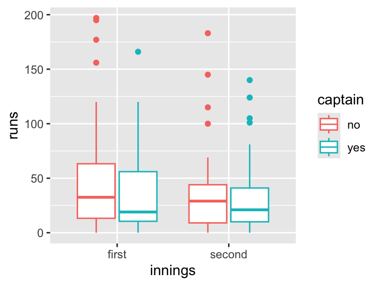
Figure 19.5: Test Match runs scored by the England Cricketer Michael Vaughan, in each innings, and whether or not he played as captain. His scores tended to be higher when he did not play as captain. Source: ESPNcricinfo.
I prefer this to the histogram plot. Note that it’s more helpful to map captain to colour and innings to the \(x\)-axis than vice-versa, as this makes it easier to compare the effect of ‘treatment’ (captain) within each ‘block’ (innings).
19.6 Exercises
Exercise 19.1 Below are three plots. For each plot,
- run the code in R to reproduce the plot.
- Think about how each plot might be improved.
- Modify the R code to achieve a better plot.
Hints are given for each plot, but try not to read them until you have had your own ideas!
- This plot uses the built in data set
airquality. Type?airqualityfor more details.
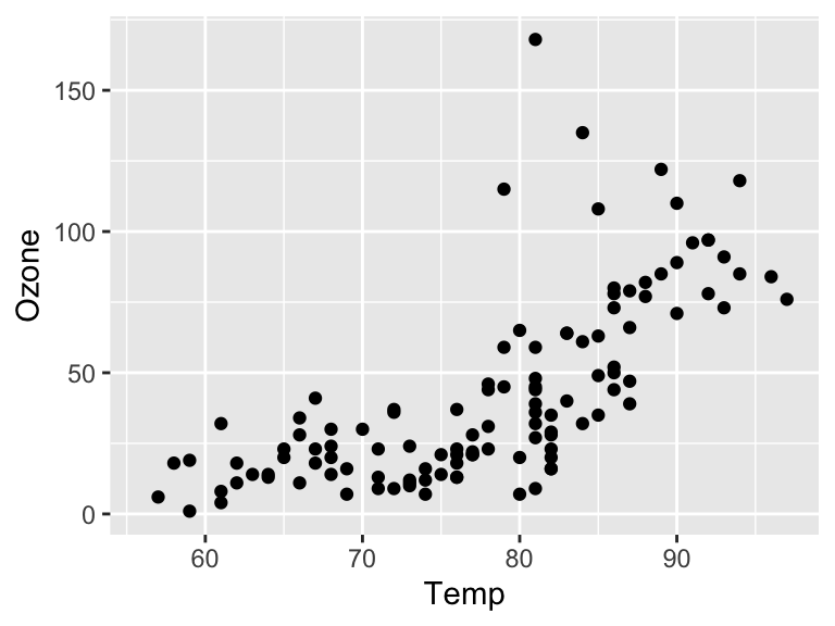
Figure 19.6: Scatter plot of ozone versus temperature
This plot fails on all levels regarding The basics and The caption test! Use the help file so you can specify more informative labels.
Later, we will be using R Markdown to add captions to plots, so for now, just suggest some text that would be more suitable for the caption.
- This following plot uses the
medalsdata set from theMAS6005package, and shows number of gold medals against population size.
ggplot(MAS6005::medals, aes(x = population, y = gold)) +
  geom_point() +
labs(x = "population size", y = "gold medals won") 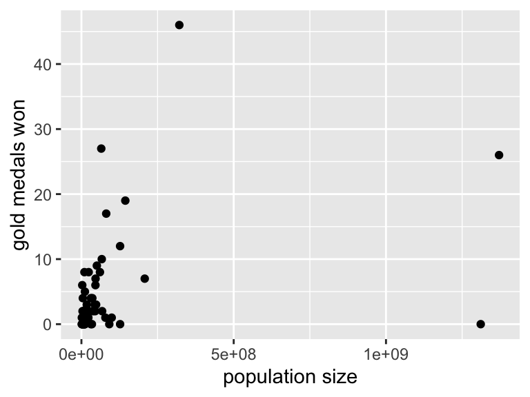
Figure 19.7: Number of gold medals won against population size for the Rio 2016 Summer Olympics. Although India and China have similar population sizes, China was much more successful. Source (population data): World Bank.
- The caption refers to India and China. Although the reader might guess which points are these two countries, they shouldn’t have to! Annotations would help.
- The bunching of most of the points in the bottom left corner doesn’t look very nice. A log-scale \(x\)-axis is worth trying.
- The scientific notation used for the \(x\)-axis scale is unfriendly for the general reader. It might help to express population size in units of millions.
- The following plot uses the
inequalitydata set from theMAS6005package, and shows income inequality for different countries.
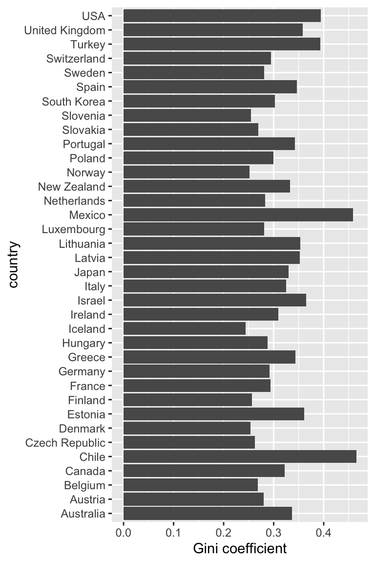
Figure 19.8: Income inequality as measured by the Gini coefficient for 36 OECD countries, reported in 2016. The UK was ranked 7th worst. Source: OECD.
- Visualising the rank order is difficult here, as the bars are arranged in alphabetical order of country. Ordering them by Gini coefficient would help. See this example in the R Graphics Cookbook
- The \(y\)-axis label “country” is unnecessary here, and can be removed.
- As the caption refers to the UK, we could try to make the UK observation more distinctive in the plot. Here, you could try using the
fillargument ingeom_cols(), specifying it to be a vector of 36 colours: 35 the same, and one different for the UK.
Bonus challenge! Tufte (2013)2 suggests having gaps within the bars to create a nice grid effect (“data-ink maximisation”). Try a Google image search for “Tufte bar chart”. Can you create this effect?
19.7 Data sources
Air quality data obtained the New York State Department of Conservation (ozone data) and the National Weather Service (temperature data), provided in the R
datasetspackage.Inequality data obtained from OECD (2016), Income inequality (indicator). doi: 10.1787/459aa7f1-en [Accessed on 17 August 2016]
Population data obtained from The World Bank. Accessed 6th October 2015.
Medal table obtained from https://www.rio2016.com/en/medal-count-country [Accessed on 6th October 2016, but this link is no longer active.]
References
Tufte, Edward R. 2013. The Visual Display of Quantitative Information. Second edition. Graphics Press.↩︎